
The good ol’ boy politicians of the South love to preach
about unbridled capitalism and Christian morality and how a “rising tide lifts all boats.” But, in
reality, the South stands out as a place where old-fashioned conservatism doesn’t
seem to have taken hold.
about unbridled capitalism and Christian morality and how a “rising tide lifts all boats.” But, in
reality, the South stands out as a place where old-fashioned conservatism doesn’t
seem to have taken hold.
Many media outlets have pointed out that the Republicans
have led the charge on cutting food stamps but the deep Red States of the old
Confederacy have some of the highest usage rates for food assistance.
have led the charge on cutting food stamps but the deep Red States of the old
Confederacy have some of the highest usage rates for food assistance.
Over at The Huffington Post they have compiled nine maps that all point to a poor quality of life in the South. Here are a few examples:
Poverty Rates
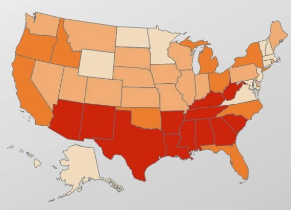
As many as one in four Southern kids lives in poverty,
compared to the national average of one in five, according to HuffPo.
compared to the national average of one in five, according to HuffPo.
In the map above, red shading indicates a poverty rate
between 17.9 and 22.8 percent. Orange indicates 15.9 to 17.8 percent; light
orange, 12.2-15.8 percent; pale yellow, 9 to 12.1 percent. As you can see, there’s
a lot of high-poverty red in the South.
between 17.9 and 22.8 percent. Orange indicates 15.9 to 17.8 percent; light
orange, 12.2-15.8 percent; pale yellow, 9 to 12.1 percent. As you can see, there’s
a lot of high-poverty red in the South.
Climbing The Economic Ladder
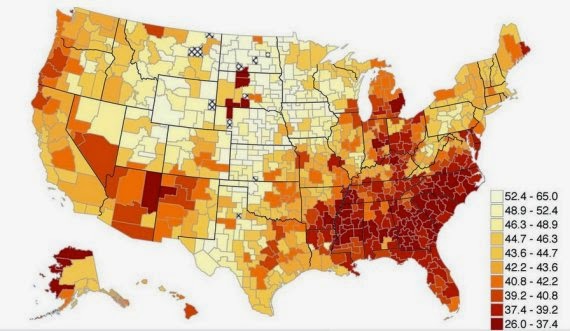
If you want to achieve the American Dream, don’t move to
the South, HuffPo reports. That’s because states in the South have extremely
low levels of economic mobility. In the map above, pale yellow represents
places with higher mobility, while red indicates low mobility.
the South, HuffPo reports. That’s because states in the South have extremely
low levels of economic mobility. In the map above, pale yellow represents
places with higher mobility, while red indicates low mobility.
Teen Births
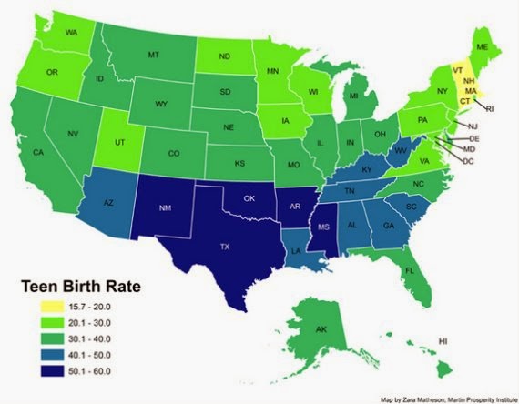
This map plots birth rates among women ages 15 to 19. In
states shaded dark blue, there are more than 50 births per 1,000 teenage women.
states shaded dark blue, there are more than 50 births per 1,000 teenage women.
You may have noticed that South Carolina ranks poorly on
all of these maps but I recently came across another distinction for the
Palmetto State. A blog site that favors schools of choice reported that in 2009
a study found that 11of the worst schools in the U.S. were located in
South Carolina, despite S.C.’s relatively small student population.
all of these maps but I recently came across another distinction for the
Palmetto State. A blog site that favors schools of choice reported that in 2009
a study found that 11of the worst schools in the U.S. were located in
South Carolina, despite S.C.’s relatively small student population.
Here’s a part of what Voice for School Choice reported:
“According to this study, South Carolina public schools account for almost
half of the nation’s 25 Worst Schools. Increasingly worse reports about South
Carolina’s public education system have been glossed over by indignant
education bureaucrats who urge parents to ‘stay the course,’ and stay focused
on the state’s ‘high
standards.’
half of the nation’s 25 Worst Schools. Increasingly worse reports about South
Carolina’s public education system have been glossed over by indignant
education bureaucrats who urge parents to ‘stay the course,’ and stay focused
on the state’s ‘high
standards.’
“While education officials frantically try to pass the
blame, graduation rates have plummeted to horrific levels, SAT and ACT scores remain uncompetitive, and achievement gaps between black and white students have grown.”
blame, graduation rates have plummeted to horrific levels, SAT and ACT scores remain uncompetitive, and achievement gaps between black and white students have grown.”
 f
f


How can a credible observer* post this and then follow it up with a post singing Rep. Paul Ryan's praises for comments that completely ignore every data point in this post?
* I mean, what do you call yourself now? Columnist? Journalist? Are you a real-life Rick Redfern, with a wall full of decades-old journalism awards and nothing to show for it but a Blog?