
As online news
sites of all kinds embrace graphics, charts and interactive maps to visually
draw in readers, some media outlets, such as Vox and The Washington Post’s
Wonkblog, perform this task with consistent excellence.
much.
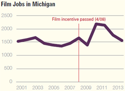
Mackinac Center may have produced the latest example of a graph that’s too
small, too simple and, worst of all, a seeming contradiction to the text of the story.
The story was
the latest installment in the Mackinac Center’s critique of Michigan’s tax
credits for the film industry. But the graphic (above) seems to show that, shortly
after film incentives were adopted in 2008, while the state’s economy was in the
middle of a cliff-dive, film-related jobs in Michigan took off.
In 2009-11,
while Michigan was struggling mighty to dig itself out of a hole created by a
loss of nearly 1 million jobs over the previous decade, film jobs were one
bright spot, according to the Mackinac graphic, which relies on U.S. Bureau of
Labor Statics information.
numbers aren’t large, it appears from the graph that film jobs shot up by about
60 percent from 2009-11, from about 1,400 to roughly 2,250. The job levels held
steady for a year and then dropped off as the tax credits were sharply
curtailed.
Now, that’s a
graph that would come in handy for a story about the need to restore the film
credits. But here is what the text of the Mackinac Center piece, a guest column
by a southern California professor, had to say:
A Senate Fiscal Agency report concluded
that Michigan spent $37.5 and $100 million on tax credits in 2009 and 2010 to
generate just $21.1 and $59.5 million, respectively, in production activity. In
2013, the Michigan Economic Development Corporation reported that film
incentives created zero full-time jobs.
is either an annoying contradiction for the reader or a piece of information
that inadvertently tells another side of the story.
Yet, the
Mackinac Center’s poor use of graphics pales in comparison to the botched job
by Business Insider in trying create a map that demonstrates “the
fastest-growing town in every state.”
One quick look
at the map (below) immediately draws a curious response as it consists almost entirely
of cities that virtually no one has ever heard mentioned: Lithopolis, Ohio;
Pike Road, Alabama; Houston, Alaska.
Relying on recently
released U.S. Census figures that show estimated population growth from 2013 to
2014, Business Insider’s map declared that the fastest-growing town in Michigan
is Sylvan Lake in Oakland County. How’s that?
Well, the raw
data shows that Sylvan Lake grew by 2.7 percent in one year. The problem is
that the gain amounted to 47 people. The city went from 1,752 people to 1,799
people.
just how misleading the “fastest-growing” distinction award to Sylvan Lake is,
consider that my town, Macomb Township in Macomb County, posted a gain last
years of 1,828 people – more than the entire population of Sylvan Lake. My township,
in one year, managed to fit all of Sylvan Lake’s populace within our borders,
plus a few dozen more.
Reporting on
population changes is always a bit of a tricky business because small towns can
post a small increase that looks large as a percentage. But the Business Insider
map takes disparity to a whole new level. Nearly every town on the map saw an
increase of less than 1,000 people last year yet the visual presentation,
relying on percentages, presents a very different and very misleading picture.
surely tossed this information aside when they looked at the accompanying BI
chart with the raw numbers. At the top of the list with a 48.9 percent increase
in population is some place called Vineyard, Utah.
Never heard of
it? That’s because Vineyard’s new population zenith stands at 691 people.